V symbol
The angular V. Subtle pieces, navigation icons, labels, tabs, avatars.

The working reference for designing VAUNT.
A heavy italic wordmark. An angular V. One coral accent.
The VAUNT wordmark / Preserved in vectorVAUNT is a technical training line: premium fits and fabrics for people who lift, run and condition, and who want the same pieces to carry them out of the gym. Its character comes from a heavy italic wordmark, an angular V and one coral accent.
Pick a volume and commit to it.
Quiet V, or the full wordmark.
The wordmark leans. Layouts, crops and type keep that momentum: strong diagonals, cropped letters, nothing static.
Quick-dry knits, laser perforation, taped seams, reflective trims. Show the construction up close.
Black, bone and the garment’s own tone. Coral appears once, on purpose.
| Principle | What it changes |
|---|---|
| Who we serve | Lifters, hybrid athletes, runners and cross trainers, men and women, who want technical pieces that look as considered outside the gym as in it. |
| What we build | Oversized heavyweight tees and cutoffs, compression layers, 2-in-1 shorts, tech joggers, shells, fleece and seamless women’s sets. |
| What makes it VAUNT | The heavy italic wordmark, the angular V, a single coral accent, and technical trims: reflective tabs, silicone marks, jacquard waistbands. |
| Subtle and strong | Subtle pieces carry a small tonal, reflective, embossed or coral V. Strong pieces carry the wordmark across a back, a chest, a leg or a waistband. |
| How we judge a design | Is it clearly subtle or clearly strong? Does the mark follow the construction? Is coral the only color, if it is there at all? |
Use “Technical training line.” as the brand descriptor and “Built heavy. Cut technical.” as the campaign line. Keep one campaign idea dominant on each surface.
The VAUNT wordmark is the voice; the V is the signature. Statement pieces and first encounters lead with the wordmark. Subtle pieces, icons and trims use the V.
Keep the V’s sharp top-left tip, the broader right arm and the pointed base, and keep the wordmark’s forward slant and tight letter spacing. Use the supplied SVGs; never retype VAUNT in a font or mirror the V.
Measure from the visible artwork. Reserve x on every side of the V. For the wordmark, reserve half its capital height; lockups follow the wordmark rule.
Start at 24 px wide for a digital V and 18 px high for a digital wordmark. On garments, keep the V at least 12 mm wide so the tip and base stay sharp.
Do not stretch.
Do not add outlines.
Do not rotate.
★Do not add a crest.
Also avoid gradients, bevels, drop shadows, upright (unslanted) versions of the wordmark, and arbitrary re-spacing. Reflective, silicone and embossed applications are part of the system; glitter and metallic foils are not.
Archivo carries headlines and reading copy; its width axis gives the expanded heavy italic that echoes the wordmark. JetBrains Mono sets labels, codes and specifications, the technical layer of the brand.
Quick-dry knit.
Laser-perforated yoke.
Body copy, descriptions, fit notes and editorial text. Say what the piece is and how it is built.
Archivo on Google FontsVAUNT · TECHNICAL LINE
R22 / STONE / SIZE M
Labels, product codes, sizes, specifications and captions. Uppercase with open tracking.
JetBrains Mono on Google Fonts| Role | Typeface | Size / rhythm | Treatment |
|---|---|---|---|
| Campaign display | Archivo ExtraBold Italic, expanded | 56–110 px desktop / 44–60 px mobile; 0.9–1 line height | Uppercase; slight negative tracking; one short statement. |
| Section title | Archivo Bold 700 | 28–40 px desktop / 24–30 px mobile; 1.05–1.15 line height | Sentence case for guidance; uppercase for campaign emphasis. |
| Reading copy | Archivo Regular 400 | 16 px / 1.6–1.8 line height; 55–70 characters per line | Sentence case; readable contrast; paragraphs of one idea. |
| Product information | Archivo Regular / Medium | 14–16 px body; names may use 20–24 px | Direct, specific and easy to scan. |
| Labels + specs | JetBrains Mono 400 | 9–12 px; 1.4 line height | Uppercase; +0.12 to +0.18 em tracking; codes, sizes and short phrases. |
| Wordmark artwork | Outlined VAUNT wordmark | Preserve asset proportions and built-in spacing | Never retype VAUNT in a font; use the supplied artwork. |
The existing store uses compact 8–11 px editorial labels in some modules. Keep these to short supporting codes; use the larger reading sizes above for new explanations, policies, and decisions. Use real HTML text for website content, rather than image-based copy.
Black is the brand surface; bone carries the wordmark on it. Coral is the single accent. The extended colors are garment tones: washed blacks, charcoal, stone, oxblood and olive.
Select a swatch to copy its hex value.
The 70 / 25 / 5 balance is a composition cue for campaign and brand surfaces. Product listings stay on the light studio grey so garments read accurately. Coral never sets small text on white (it fails contrast); use it for marks, rules and large display only. Hex values are sRGB targets; approve fabric, thread and ink against real samples.
15.80:1 · Passes normal text contrast
Normal text needs at least 4.5:1; large text needs 3:1. Use the unrounded ratio for the pass decision. W3C contrast guidance ↗
Loud marks on the garment.
Clear information on the page.
Space creates authority. Align the composition, let images breathe, and keep product information predictable. Start with a 4 px spacing unit, then make restrained optical adjustments.
48121624324864BAG| Measurement | Desktop / above 1100 px | Mobile / 760 px and below |
|---|---|---|
| Page edge | 36 px; 48 px in the store’s very wide layout | 18 px |
| Section vertical space | 65 px in the store; use 64 px for new modules | 42 px in the store; use 40 px for new modules |
| Product grid | 4 columns; 15 px horizontal gap | 2 columns; 10 px horizontal gap |
| Header | 91 px; centered wordmark; 29 px black announcement strip in mono | 75 px; menu + wordmark + bag; 26 px announcement strip |
| Product detail layout | About 62% gallery / 38% information; 65 px gap | One column; swipeable gallery before product controls |
| Reading width | Keep paragraphs to roughly 55–70 characters | Fit the column; avoid shrinking type to keep a desktop line break |
Headings, grids, dividers, and supporting copy should begin on the same line. Product detail pages can use a wider visual field, while long-form pages benefit from a restrained reading column.
Collapse side-by-side sections, keep product cards in two columns, and give the gallery a horizontal swipe. Keep color, size, and the primary action easy to reach. Between breakpoints, allow fluid widths and wrapping.
The website should make the collection easy to understand. Use simple borders, restrained corners, direct labels, and a clear hierarchy between reading, choosing, and acting.
Black-filled primary actions on light surfaces, coral-filled on black. Outlined secondary actions. Deep coral focus ring with a 4 px offset. Aim for at least a 44 × 44 px interactive target.
| Element | VAUNT rule |
|---|---|
| Surfaces | Black #0E0E0F for brand moments (hero, footer, entrance); white and Paper #F2F2F1 for product browsing. Shadow only when layering needs it. |
| Dividers + corners | 1 px #E4E6E6 dividers; 3 px control radius; 5 px image-card radius. Keep the geometry restrained. |
| Text hierarchy | Black for essential information on light; Bone on black. Ash #BDB8B0 for secondary text on black; JetBrains Mono for labels and codes. |
| Product cards | Consistent image field, clear name, price, color name, and restrained swatches. Show the garment before the graphics. |
| Selected states | Border or filled state plus an accessible selected label. Pair color swatches with names. Do not communicate state by color alone. |
| Motion | 150–250 ms controls; optional 400–550 ms subtle image scale. Honor reduced-motion preferences and preserve stable layouts. |
| Product descriptions | Fit and construction first. Put fuller detail in labeled expandable sections. Keep claims tied to verified specifications. |
Quick-dry technical jersey with a small reflective V on the chest. Final composition and performance specifications follow physical sampling.
Focus is a functional accent. Garment branding can be tonal; product prices, form labels, stock information, and purchase actions need clear contrast. Use semantic headings, keyboard-operable controls, descriptive image text, and direct error messages.
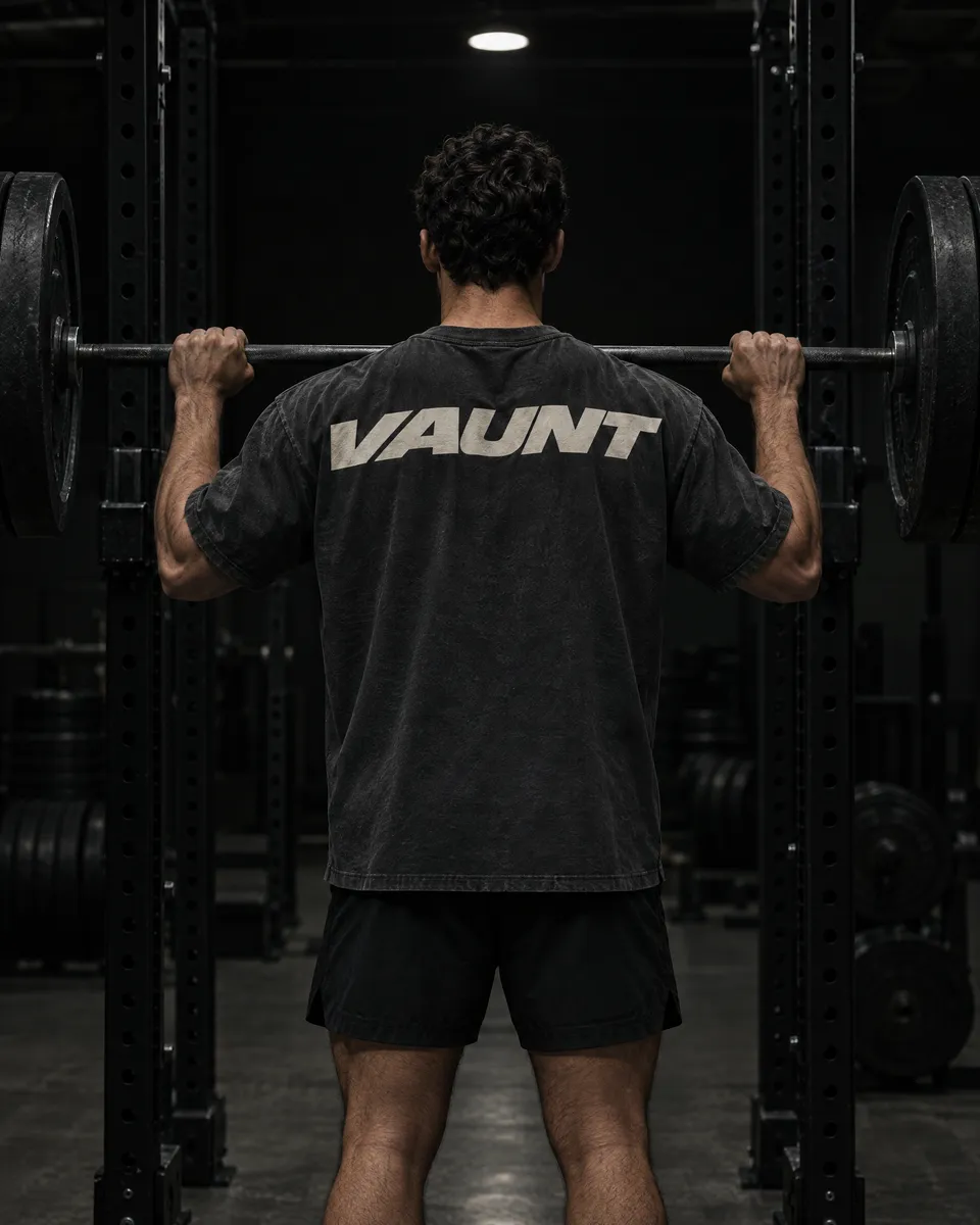
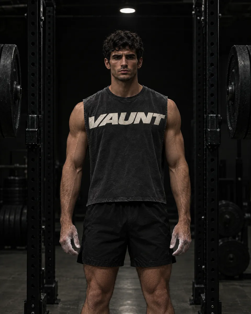
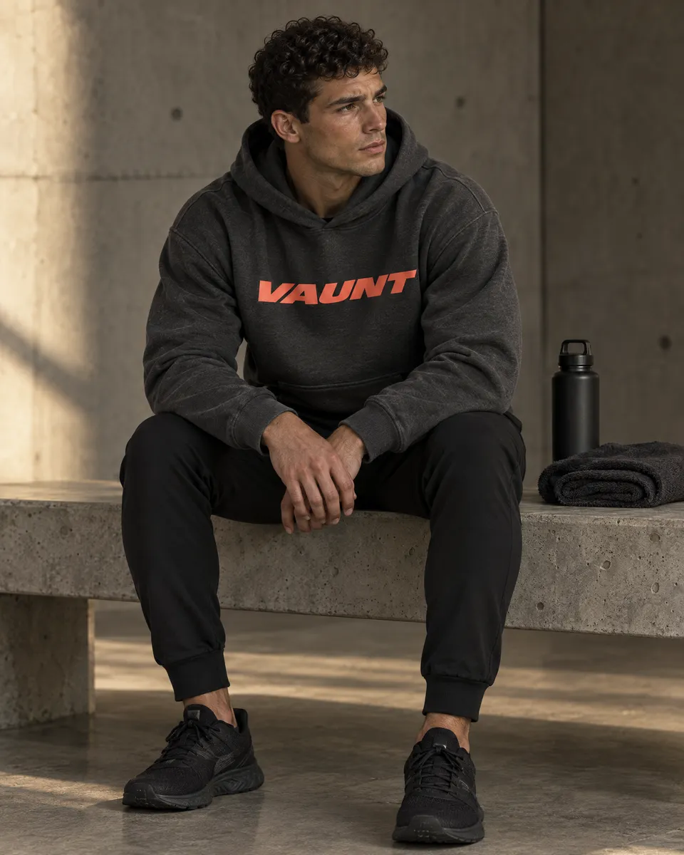
Every piece commits to one volume. Subtle pieces carry a small V: tonal, reflective, embossed, silicone, or the single coral V. Strong pieces carry the wordmark at full size across the back, chest, leg or waistband.
| Application | Placement + treatment | Starting target |
|---|---|---|
| Subtle chest V | Small V on the left chest or centered: tonal reflective, silicone, embossed, or the single coral V. | V 12–25 mm wide; top 70–90 mm below the high point shoulder. |
| Back wordmark | Bone or charcoal VAUNT across the upper back, small V on the front chest. | Wordmark 260–320 mm wide; top 80–100 mm below the collar seam. |
| Chest statement | Wordmark across the full chest, scaled to the panel; may crop at the side seams on tanks. | Wordmark 240–300 mm wide, or panel width on crop-off tanks. |
| Vertical wordmark | Use the supplied vertical artwork, reading bottom to top, down a leg, sleeve or front panel edge. | Leg 180–260 mm tall; sleeve 120–180 mm; panel to fit. |
| Trims | Reflective VAUNT woven tab at a side seam; VAUNT heat transfer at the back neck; repeating VAUNT jacquard waistband. | Tab 8 × 30 mm exposed; neck print 40–60 mm wide; jacquard 40 mm band. |
These are development targets, not approved manufacturing measurements. Resolve final placement across sizes in a tech pack. Sample reflective, silicone, emboss and jacquard methods early: they vary most between factories. Washed garments change how prints age, so approve prints on the finished, washed fabric.
Plastisol or discharge for washed heavyweights, reflective transfer for running pieces, silicone on compression, emboss on fleece, jacquard on waistbands. Match ink and thread under neutral light.
One coral mark per garment, and only when it is the only color on it. Never combine coral with a second accent or print coral small on a busy surface.
Product imagery explains the garment on the light studio grey with close-ups of marks and construction. Campaign imagery is dark, directional and physical: under the bar, at the rack, on wet streets at night.
Hard directional light, dark gyms, raw concrete, city streets at night. Product shots on flat light grey #EBEBEE. Keep fabric texture and believable shadows.
Athletic men with credible movement and natural expressions. Build coordinated outfits. Keep garments and bodies recognizable across the views of one product.
Protect the silhouette and garment length. Leave negative space for campaign copy. Keep product crops consistent. Avoid crushed blacks and glossy, metallic-looking fabrics.
Use the sequence as a launch photography brief, adapting detail shots to each product. New colorways need consistent lighting and pose. Current store imagery illustrates the design direction; compare final production photography against sampled garments before launch.
Say what the piece is, how it fits, and why a detail matters. Write with control: short campaign statements, useful product sentences, and calm instructions when someone is choosing or buying.
“Built heavy.
Cut technical.”
Oversized drop shoulder. Quick-dry jersey with a laser-perforated back yoke. A small reflective V on the chest.
“Unleash your inner emperor.
Dominate everything.”
Grand language without useful information competes with the garment and weakens the quiet identity.
| Situation | Voice direction | Example |
|---|---|---|
| Campaign | One short idea, confidently stated. | Built heavy. Cut technical. |
| Product | Name the fit, construction, and specific signature. | A close-fitting raglan tee with a controlled curved hem. |
| Action | State exactly what happens. | Choose a size. / Add to bag. / View the collection. |
| Error | Name the missing step and how to resolve it. | Choose a size to add this piece to your bag. |
| Performance | Use a claim only when the specification or test supports it. | Describe the intended material until tested performance is confirmed. |
Write VAUNT in uppercase and product names consistently. Use the palette names (Black, Bone, Coral, Onyx, Stone…) rather than inventing a new name for the same color. Avoid unverified fabric trademarks, antibacterial claims, body transformation promises and hype the garment cannot substantiate.
Use vector artwork for crisp scaling and print layout; use transparent PNGs when the application needs pixels. Wordmarks are outlined, so they retain their shape without an installed font.
The angular V. Subtle pieces, navigation icons, labels, tabs, avatars.
The heavy italic name. Statement prints, first encounters, packaging, campaign.

V and wordmark together. Covers, press material, swing tags.

The wordmark turned to read bottom to top, for legs, sleeves and side seams.
| File | When to use it | What is included |
|---|---|---|
| SVG | Website logos, print layouts, embroidery artwork handoff, and any scalable identity use. | Real vector paths; transparent canvas; outlined lettering; no embedded raster or font dependency. |
| PNG | Presentations, social templates, garment mockups, and applications without SVG support. | Transparent RGBA. V: 1024 px wide; small V: 256 px wide. Wordmark and lockup: 2048 px wide. Vertical wordmark: 2048 px high. |
| Fonts | Editable layouts and website text. | Archivo and JetBrains Mono, both free under the SIL Open Font License from Google Fonts. |
| Tokens | A starting point for new website modules and handoff. | CSS variables and JSON values for color, spacing, typography, corners, and the store breakpoints. |
Files are cropped to visible artwork; add the clear space specified in section 02 in the layout. Bone artwork can look blank on a light preview: place it on Black. Print suppliers should prepare process-specific separations and verify thin detail at the final physical size.
Before approving a page, garment, or campaign, look at the whole composition. The identity should remain coherent when the headline changes, the model moves, and the logo gets smaller.
Is the garment, message, or next action immediately clear?
Do the silhouette, crop, alignment, and spacing feel controlled?
Is the wordmark or V the supplied artwork, slanted, unmirrored and given clear space?
Is the piece clearly subtle or clearly strong, with at most one coral accent?
Can someone read, navigate, and choose comfortably on a phone and with a keyboard?
Does the copy describe the actual product, with physical samples or tests behind performance claims?
This reference supports new product design, supplier discussions and sample reviews. It records the current direction; it does not release a garment for bulk manufacture.
The angular V symbol. The heavy italic VAUNT wordmark. Clean typography. Muted colors. Matte finishes. Small exterior marks and discreet VAUNT seam signatures. These guide the next design.
Fabric blends and weights, logo dimensions, print processes, trim sizes, sizing and construction are starting points. They need factory feasibility review and physical samples.
No garment is marked production approved here. Record actual measurements, test results, approved artwork, supplier articles and signed sample references in the product tech pack.
| Collection | Design role | Reference |
|---|---|---|
| Founder's Collection ↗ | Founding range / training + everyday | Original foundation concepts |
Reference revision 02 · 27 October 2026. Legacy concepts intentionally remain visible for comparison. Product-specific callouts describe their own concept; the physical sample and released tech pack must resolve differences before production.
Every placement is described from the wearer’s perspective. Measure the visible artwork, not its transparent canvas. Use finished seam lines as reference points and show the mark on a flat technical drawing.
| Product family | Current location | Sampling starting point / open decision |
|---|---|---|
| Tees, full-back tanks and cutoffs | Center back, below collar seam; tiny vertical VAUNT wordmark at lower wearer’s left seam. Front generally blank. | Trial V at 16 mm visible width; trial artwork top 20 mm below finished collar seam. Compare 12 / 16 / 20 mm on actual fabric. These are new trial targets, not approved measurements. |
| Narrow Y-back stringers | V centered within the upper Y-back panel, not on skin or over binding. | Use the available flat panel width first. Keep the sharp left tip and pointed base intact and leave clear space from edge binding; reduce or move the mark only after reviewing a full-size mockup. |
| Hoodies and outer layers | Follow the product concept: back hood, below yoke or another stable rear panel. | MD10 puts the V on the back of the hood; keep the body back blank. Confirm location with hood raised and lowered. |
| Shorts and pants | Small V at rear right below waistband or above rear pocket; tiny vertical wordmark at the left seam. | Trial V at 12–16 mm visible width, subject to artwork detail and panel stability. Dimension from finished waistband or pocket seam. |
| Caps and beanies | Follow the actual product: newer six-panel caps have a blank front and rear V above the adjuster. | MD11 rear mark is nominal 14 mm in the concept; axis is unresolved. Confirm width × height and embroidery sew-out. Earlier front-mark caps remain legacy concepts. |
| Socks and gloves | Rear heel, outer ankle, cuff or hand panel only where specified. | Small knit-in or transfer marks require a legibility test at worn stretch. Preserve left/right pairing and avoid a raised seam against skin. |
| Straps, bags and accessories | MD12 V near wrist loop; tiny VAUNT tab at loop seam. Other accessories follow their product page. | Confirm orientation while worn, attachment strength and friction at the skin/contact area. Keep graphics away from working grip surfaces. |
| Vertical VAUNT wordmark | The wordmark turned to read bottom to top, aligned to wearer’s left seam. | Trial 25–35 mm total visible height on new apparel. Keep it fully within a panel or use a separate seam label; do not bridge a bulky seam with a transfer. |
| Source | Recorded callout | Before sampling |
|---|---|---|
| Legacy brand guide | V 12–16 mm wide; vertical wordmark 25–35 mm high. | A general development baseline, not a universal production spec. |
| Original R15 stringer spec | V target 30 mm wide; vertical wordmark 45 mm high. | Larger than the general baseline. Compare both sizes on the actual Y-back and choose one in R15’s tech pack. |
| Seasonal concepts | Some tops specify the V about 22 mm wide; other entries give a number without naming its axis. | Preserve the source intent. Convert every ambiguous callout to explicit W × H before issuing artwork. |
| Mass Division concepts | Nominal V values 12–18 mm depending on the product; source often omits the measurement axis. | Confirm width versus height for each SKU. Do not treat these as approved heights. |
| Foundry Cutoff R16 | Back V visually reduced to about 75% of the selected concept. | A visual reduction has no final millimeter size. Dimension the artwork in the new tech pack. |
Suggested trial tolerance: agree ±2 mm placement and ±1 mm artwork size with the supplier only where achievable. These are discussion targets. Do not scale marks automatically with every garment size; inspect XS and XXL against the base size and define any needed offsets.
Use the original vector outline and a single flat color. A convincing digital mockup is a placement reference; it does not establish thread, ink, stretch or wash durability.
| Garment / surface | Proposed mark treatment | Physical approval |
|---|---|---|
| Onyx or black | Dark offset charcoal. Existing references use both #303236 and Graphite #3D4347 as screen cues. | Choose one physical drawdown per fabric, viewed dry and stretched. Tonal V should be discoverable up close. Do not assume either hex is a textile standard. |
| Oxblood | A darker tonal Oxblood V and quiet matching seam signature. | Approve ink or thread alongside the dyed garment; avoid bright red or a contrasting white logo by default. |
| White | Soft light warm-gray tonal mark, as shown on the Column Rib Tank. | Check opacity, staining, yellowing and show-through on the actual knit. Earlier white-on-white experiments remain concepts; record the selected version. |
| Taupe, Stone, Olive and Silver | A darker tone within the garment color family, usually matte. | Match ink, thread and label ground against lab dips; use a physical control swatch under agreed neutral lighting. |
| Winter reflective exceptions | Only the understated reflective marks called out on the specific running pieces. | Confirm the film supplier, adhesion, flex and wash behavior. Reflective appearance alone does not establish visibility or safety performance. |
| Process | Best trial use | Sample review |
|---|---|---|
| Matte transfer / silicone-type transfer | Smooth stretch jerseys and compression layers. Confirm compatible ink/film with the mill and printer. | Inspect the V’s sharp tip and pointed base, edge lift, cracking, stretch recovery, shine and skin-side hand. Supplier sets and records actual temperature, pressure and dwell. |
| Screen print | Cotton jersey or stable fabric where a soft, flat matte result is feasible. | Approve a full-size strike-off; review ink hand, cure, edge definition, stretch and wash adhesion. No glossy or thick rubber effect by default. |
| Embroidery | Stable cap panels, outerwear and suitable labels; test garment weight before using on fine knits. | Supplier digitizes the exact artwork and supplies a sew-out. Review tip and point sharpness, edge definition, thread sheen, puckering and backing against skin. |
| Woven / knit-in mark | Seam labels, socks or compatible knit structures. | Approve yarn colors and actual-scale weave/knit sample. Fine details may not survive; any simplified artwork needs a separately reviewed revision. |
| Blind deboss | The black HT01 paper hang tag. | Recessed relief, no foil or raised emboss by default. Trial depth, edge definition and rear show-through on the proposed duplex stock. |
Never redraw the V from a typeface. It is one flat shape: preserve the sharp top-left tip of the narrow left arm, the broader right arm and the pointed base. If a process cannot reproduce the master, increase its size or propose a controlled simplification for review. “Embroidery-ready” requires digitized stitch data and a physical sew-out; SVG artwork alone is not that file.
Keep seams deliberate and thread quiet. The following are construction proposals to discuss with the sample room; the factory must match the stitch, needle, thread and tension to the actual fabric.
| Area | Proposed construction | What to inspect on the sample |
|---|---|---|
| Jersey body and side seams | Overlock joining with tonal thread; use a suitable stretch seam on high-extension products. | No open seam under movement, puckering, needle holes or scratchy seam allowance. Review inside and outside. |
| Tees: sleeve and body hems | Twin-needle coverstitch or an agreed clean equivalent; 20–25 mm turnback as a trial. | Level hem, no tunneling or roping, stable stretch recovery. Confirm finished hem depth on the tech pack. |
| Compression panels | Low-profile flat seams or a tested low-bulk stretch construction along the anatomical lines. | No ridge pressure or chafing during presses, rows and squats. Confirm seam stretch with the intended negative ease. |
| Crew neckline | Rib or self-fabric binding to suit the concept; secure the back neck with soft stabilization where needed. | Collar sits flat, returns after pull-over, does not wave or twist after washing. Establish finished rib width. |
| Deep cutoffs | Controlled raw or softly rolled armholes only on designated raw-edge products. | Review fraying, curl and opening growth after wash. Finish neckline and hem normally unless a SKU explicitly says otherwise. |
| Stringers and rib tanks | Clean narrow binding or agreed coverstitched edge; keep Y-back symmetry. | No gaping, twisted strap or cutting-in under arm. Check armhole during reach and loaded movement. |
| Woven shorts and pants | Secure seam construction with discreet reinforcement at pocket openings, splits and drawcord exits. | Full squat mobility, stable pocket bags and no pressure from reinforcement. Match visible bar tacks to the shell. |
| French terry and pump covers | Low-bulk joining suitable for the weight; clean rib or open hem exactly as designed. | Check seam bulk, loop snagging, shrinkage and washed hand. Preserve room through chest, shoulders and thigh. |
| Straps and load-bearing attachments | MD12 proposes dense cotton webbing with reinforced box stitching at sewn loops. | Factory must validate webbing, seam geometry and attachment strength for intended use. Do not infer a rated working load from images. |
Suggested sewing trials, not locked settings: 10–12 stitches per inch on ordinary jersey; 8–10 on heavier terry or woven assemblies, adjusted to substrate and seam type. Request thread specification, needle system, seam allowance and stitch density on the sample record. Use visually tonal thread; reflective or contrast stitching needs an explicit product exception.
Treat the inside label, exterior seam label and paper hang tag as three different parts. Each needs its own artwork, dimensions, material and attachment callout.
| Trim | Design + proposed location | Sample requirements |
|---|---|---|
| Internal brand / size identification | Soft printed neck label on lightweight tops, or a soft low-profile woven label where suitable. Center back inside, clear of exterior V. Bottoms: inside waistband. | Trial size is product dependent. Show VAUNT and size clearly, use the actual font/artwork, and inspect against skin. Do not print final fiber content until supplier composition is confirmed. |
| Care / composition label | Soft internal label at wearer’s left side seam or inside waistband; keep it out of high-friction areas. | Supplier to confirm actual fiber percentages, origin, care instructions and applicable market labeling. Record finished size, folds and stitch-in allowance in the tech pack. |
| Exterior VAUNT seam label | Tiny vertical VAUNT wordmark, reading bottom to top, near the wearer’s left lower side seam on designated products; tonal ground and lettering. | Trial exposed 8 × 25 mm woven label, plus hidden seam allowance. This is a new sampling option, not a measured image dimension. Compare with the printed vertical wordmark and select one treatment per SKU. |
| Caps and accessories | Tiny VAUNT adjuster tab or seam label where shown. | No scratchy raw label edge, interference with buckle travel, grip or pocket use. Verify orientation when worn. |

The existing pack records a recessed blind-deboss finish selected for the symbol. Its artwork and files still carry the previous brand marks: reissue them with the VAUNT V symbol and wordmark before quoting. The package is for quotation and physical sampling; the stock, caliper, ink and assembled cord remain to be approved.
Use the outlined artwork and separations in the package for tooling; the website proof is visual only. Print the 1:1 PDF at actual size and verify the trim dimensions. Existing rear variants cover the original tee’s four colors and six sizes; they do not automatically cover every new product. Update SKU copy and quantities before issuing a tag order. Agree a cord attachment that does not puncture or distort the garment face.
Select fabric for the silhouette and training use first. The table below carries the existing collection proposals into one reference. Composition and gsm are not certificates or test results.
Fine stretch jersey, mesh and lightweight woven for First Light and High Season. Check opacity, airflow, cling and pocket stability in the actual weight.
Cotton jersey, rib, French terry and compact knits for Iron Hours and Mass Division. Evaluate drape, shrinkage, wash shade and shape retention.
Matte compression, brushed jersey, waffle, double knit and insulation for After Dark. Confirm extension, recovery, bulk and moisture comfort through wear trials.
| Product | Construction / composition / weight | Status |
|---|---|---|
| R17 / Campus Cutoff ↗ | Soft, substantial cotton jersey; final fabric to be confirmed in sampling. | Material direction; blend / weight unresolved |
| R02 / Obsidian Training Tee ↗ | Matte stretch jersey | Material direction; blend / weight unresolved |
| R12 / Tech Cap ↗ | Light woven | Material direction; blend / weight unresolved |
| SP01 / Aero Raglan Tee ↗ | Fine matte stretch jersey. 88% polyester, 12% elastane. 170 gsm. | Proposed for sampling |
| SU02 / Line Stringer ↗ | Soft lightweight stretch jersey. 95% cotton / 5% elastane. 150 gsm. | Proposed for sampling |
| AU07 / Session 7-inch Short ↗ | Compact matte stretch knit. 72% nylon / 23% polyester / 5% elastane. 240 gsm. | Proposed for sampling |
| WI08 / Frame Double-knit Pant ↗ | Structured smooth-face double-knit. 68% cotton / 27% polyester / 5% elastane. 340 gsm. | Proposed for sampling |
| MD09 / Off Duty Pump Pant ↗ | Heavy washed loopback French terry. 100% cotton. 360 gsm. | Proposed for sampling |
| R22 / Signal Cutoff ↗ | Soft, washed cotton jersey with a vintage hand; final fabric to be confirmed in sampling. | Material direction; blend / weight unresolved |
| R23 / Drop Cutoff ↗ | Soft, washed cotton jersey with a vintage hand; final fabric to be confirmed in sampling. | Material direction; blend / weight unresolved |
| R24 / Vertical Cutoff ↗ | Soft, washed cotton jersey with a vintage hand; final fabric to be confirmed in sampling. | Material direction; blend / weight unresolved |
| R25 / Spec Cutoff ↗ | Soft, washed cotton jersey with a vintage hand; final fabric to be confirmed in sampling. | Material direction; blend / weight unresolved |
Approve a supplier article and color standard for each fabric. Record usable width, finish, gsm tolerance, stretch direction, recovery, shrinkage/skew, pilling, opacity, colorfastness and wash results. Review transfer and embroidery on the same lot. Do not infer anti-odor, wicking, antibacterial, UV, waterproof or thermal performance from a fabric name or generated image.
Use one revision per product and one written record per sample round. The website is the design reference; the tech pack is the controlled manufacturing instruction.
| Stage | Record / review | Exit decision |
|---|---|---|
| 01 / Development brief | Product code, collection, intended activity, front/back flats, visual references, target fit and open questions. | Agree scope and which version is being sampled. |
| 02 / Fabric and trim trials | Actual fabric swatches, lab dips, logo strike-offs or sew-outs, labels, thread and hardware options. | Choose physical articles and reject or mark alternatives. |
| 03 / First prototype | Base-size points of measure: chest, waist, hip, shoulder, body length, armhole, sleeve, thigh, rise, inseam and openings as relevant. | Measure against the proposed chart and record fit changes. Photos must identify sample code and size. |
| 04 / Movement and wash review | Press, row, overhead reach, squat and seated fit as appropriate; wash using proposed care method. Record seam comfort, growth, shrinkage and logo behavior. | Resolve fabric, pattern, construction and branding changes with written results. |
| 05 / Size set + pre-production | Verify grade rules, extreme-size fit, placement, labels, packaging and actual bulk-equivalent materials. | Approve a signed physical reference and a final dated tech pack revision. |
| 06 / Production release | Confirm supplier, quantities, approved color standards, tolerances, test plan, packing and approved sample identifier. | Issue a separate release. This draft catalog is not that authorization. |
SKU / revision / factory / sample round / date / fabric article / color lot / size / measured values / photos / issues / action owner / decision / next revision. Keep superseded samples clearly labeled.
Write every measurement in millimeters or centimeters with the unit stated. Identify width versus height. Keep approved tolerances beside each point of measure. A change in fabric, artwork or process requires another check of affected details.
The worksheet starts with the current catalog codes and leaves supplier, sample results and approval fields empty. It does not claim any sample has passed. This page and the product pages are intentionally editable as fit, materials and branding are refined.